The post What Does Your Favorite Color Say About You? Find out about your personality traits appeared first on thegreatillusion.com.
]]>What is your favorite color? Think about it for a moment: for sure, there is a shade that always cheers you up, gives you a special feeling of comfort, relaxes you, and makes you happy. This choice is not random; your favorite color reflects both your personality traits and your emotional state! Think of a color that pleases you today; remember a color you enjoyed a couple of years ago and let’s find out what it all means!
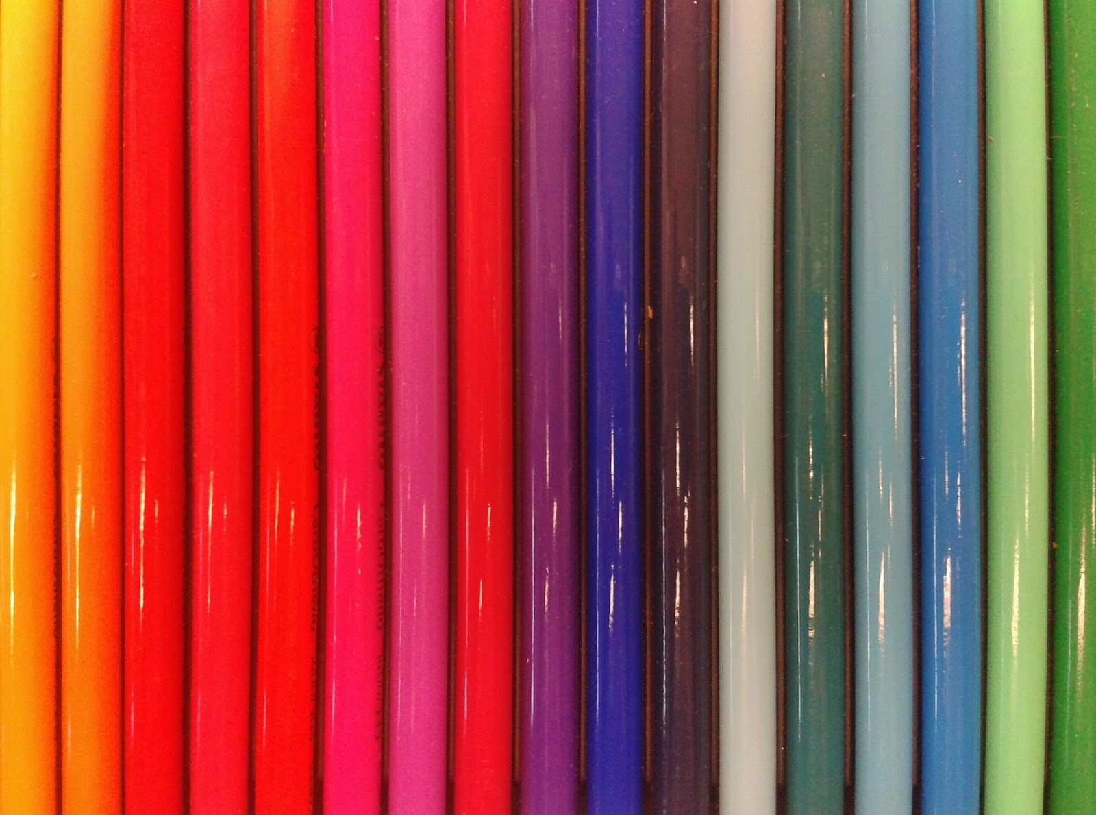
A brief description of each color
Your color is not necessarily the one that dominates your closet or the one that you paint your apartment walls year after year. To determine your color, you have to listen to yourself. Remember to look at the shades you are inspired by. The color that you imagine in your dreams defines your character.
Red
Fans of the red are always self-confident and purposeful people. This is a very bright color chosen by very bright individuals. They are active, independent, and ambitious. Such people do not tolerate routine; they strive for a rich life full of bright events and impressions. Supporters of scarlet tones are irascible, passionate, and a little selfish. They are distinguished by a strong inner energy as well as the desire to win and lead.
Yellow
Yellow is the color of optimists. Its admirers are characterized by creativity, great intuition, and a desire to develop and learn something new. These people are decisive, curious, and patient. They are able to make informed decisions, set goals, and achieve them. They adapt quickly to unfamiliar surroundings and easily get along with people. Furthermore, they are appreciated by everyone because of their openness and generosity. This color is chosen by sincere, creative people who are ready to experiment, no matter what happens in the end. The main thing is that they had fun, and the experience they gained is priceless.
Pink
Personalities whose favorite color is pink are characterized by a quiet temper, softness, and dreaminess. They have their own vision of the world, which often does not coincide with reality. They are not always able to objectively assess their strengths and abilities. Sometimes they deliberately try to appear fragile and defenseless in order to receive more care and attention, but at the same time, they are not stingy with affection.
White
If your favorite color is white, you are difficult to confuse or disorganize. Independence is very important to you. In addition, you have a well-developed skill of logical thinking, which helps you successfully cope with any challenges. It is a synthesis of all colors because it is the “perfect” color, the color of dreams. It has many meanings because it simultaneously conveys both the brilliance of light and the coldness of ice. This color can be preferred by people of any character; it does not repel anyone.
Blue
Since it is the color of the sky, it is usually associated with the spiritual elevation of a person and their purity. If you like it, it indicates modesty and melancholy; such a person often needs to rest; he or she gets tired quickly and easily; and a sense of confidence and the benevolence of others are extremely important to him or her. Blue indicates freedom, insouciance, and a tendency to change environments.
Black
Black is the opposite of white. It is the color of uncertainty, symbolizing a gloomy perception of life. These people reject the opinions of others and stubbornly pursue their goals. Black often hides true emotions, which prevents such people from making new acquaintances and maintaining good relationships, and they find it difficult to get out of conflict situations.
Brown
Brown is associated with respectability, homeliness, and family values. If a person likes this color, he or she enjoys tasty food and different pleasures. Such people look at the world with austerity and are aware of its imperfections. However, they are not just bystanders. They strive to fix the situation for the better, and often they succeed in changing the established order.
Grey
Grey is a favorite of intelligent, rational, and expedient natures. People of this color are smart and communicative. They are distinguished by a love for order—in the closet, in thoughts, in feelings. They are prone to intellectual activity and are able to analyze, which allows them to reach certain heights in the profession.
No favorite color?
If you don’t have one favorite color or shade, it doesn’t mean you’re not that kind of person! Diversity in color choices is most likely related to a person’s moment-to-moment mood, while constant preference for the same color over a long period of time may indicate an imbalance and the need to reconsider your outlook on life.
Conclusion
In everyday life, a preference for certain colors in clothing, interiors, and similar things can tell a lot. The presence of “favorite” and “not favorite” colors, undoubtedly, means a particular tendency in the human character and helps to diagnose the state of mind of this person at this particular time in life. Preferred colors can vary throughout life; in each area, there may be a “favorite”. But the most important thing is to follow your heart and soul. Do what you like!
The post What Does Your Favorite Color Say About You? Find out about your personality traits appeared first on thegreatillusion.com.
]]>The post How To Write An Amazing Artistic Resume appeared first on thegreatillusion.com.
]]>A resume is a document listing your academic and professional achievements. A typical resume would include employment history, listing your most recent job first. An artist’s resume can consist of a job history, but it also provides exhibition works, theater productions, animation shows, articles, or any venue that would showcase their work.
Sometimes an artist’s resume can contain bibliographies and reviews of the artist’s work. They can also include portfolios and other items to showcase their compositions and original pieces.
Tips for creating an artist resume
Here are some tips for creating an artist’s resume based on your field:
Actor
This resume can showcase any type of production you have been in, including theater, commercial work, television, or film. Your education might list if you’ve had professional training or received a degree in theater arts. You can also list awards received if you were honored for your work.
Art director
Your resume can list newspaper and magazine layouts and product packaging. You can also include if you’ve instructed others on forms and design, which can show strong leadership skills.
Painter or animator
A painter or animator’s resume can list any exhibitions, gallery, or firm work. It can also list any freelance employment periods where you might have taken commission for your work. Consider listing a portfolio to exhibit personal collections and commission works.
Filmmaker or director
Your filmmaking or director resume can include any films you made, directed, produced, or took part in. For example, a filmmaker or director might have an employment history in a theatrical management office or freelance projects.
Designer
Your resume can list freelance design, pro bono work, and work at design firms. For any freelance periods, you can include if the projects were on time or under budget for any freelance periods and how many tasks you completed in that time frame. Positive testimonials from past clients are also great to include on a design resume.
Photographer
A photography resume could list both freelance and permanent employment. For example, you could list your experience at the local newspaper along with freelance wedding photography work. List both on your resume under employment history and any professional studio employment. Your resume can also include exhibitions, shows, or publications your photography was featured in. Finally, you can include a link to your online portfolio if your photography has not been featured anywhere.
DJ
Your DJ resume could list any work you did as part of an events company or at a specific venue. In addition, the resume can list how many events you worked on, and the number of attendees included. For example, “DJ’ed at 350 events with 400 plus attendees.” Your DJ resume can also have the equipment you are familiar with and the types of events or clubs you work at.
Fashion designer
A fashion designer or stylist’s resume can include the following:
- Any formal education or training
- Employment at a professional firm or freelance work
- How many orders do you process, or how many clients do you service
- Hard skills like designing computer programs or sewing
Dancer
Your dance resume can list troupes or companies you performed with. You can also record the following:
- Specific parts you held
- How often the productions ran
- If you had any other duties, like choreography, inventory, or backstage work
Musician
Your resume could include professional music education or training under a master musician. You could also have freelance work, such as time in a band or playing at events like weddings or bars and restaurants. It might also be helpful to include a link to your portfolio.
How to write an artist’s resume
Artist resumes often highlight unique skills not present in a typical resume. They might include different sections, like a bibliography or an exhibition. Follow the below steps to create an effective artistic resume:
1. Keep it simple
Artists’ resumes can include bibliographies, exhibition listings, portfolio links, and other examples of creative works. You might want to include many examples for each of these sections, but consider keeping the resume on the shorter side. A museum, theater, or firm can receive many weekly submissions. A simple resume with relevant details can stand out to the recruiting team.
2. Add your contact details
Your contact details can be in the same format as a standard resume. In addition, you can provide your full name, address, phone and email. Artist resumes are occasionally available on artist, gallery, or theater websites. If you submit a resume for a website, you can omit your address, phone number, and email from the contact details.
3. Include your educational background
Include any relevant education on your artist resume, starting with the most recent. Your educational experience can include a college degree if applicable. It can also include any professional training you have received. For example, “Classically trained ballet dancer, trained under French Ballet School by Amelie Macron 2010–2012.” Your resume can also list certifications or awards received in this section.
4. List your relevant employment in the field
The next section on your artist’s resume is employment history, which should list your most recent job first. You can include freelance work as long as it applies to your field. For example, if your field is photography, you can consist of an entry like this:
Freelance Photographer
March 2020–April 2020
- Shot 25 family sessions
- Clients referrals multiplied original session bookings
- Shot 4 weddings
- Exhibition at Tampa Art Museum for Aspen Goji exhibit
5. List your most recent creative works first
Include any relevant result to the position you’re applying for. You can also list an online portfolio and a bibliography in this section. Consider making bibliographies their section if you have multiple entries. If you choose to make a bibliography its section, include it before the exhibitions section.
Artistic resume examples
Use this example as inspiration when writing a resume:
Example one
Misty Taylor
135 Mill Ave.
Kissimmee, FL
www.mistytaylorartsite.com
847-564-1353
Summary
An original artist with a vast portfolio of work that spans 12+ plus years. The portfolio includes exhibitions, solo artist shows, and critical reviews of work. I am skilled at quick but creative execution and client relations for commissioned pieces.
Education
Chicago Western University | August 2001–May 2005
Bachelor of Fine Arts, concentration in sculpture
Trained under Anton Scarsdale, Master Sculptor May 2009–May 2011
Experience
Artist (Freelance) April 2011–Present
- Create 1-2 client commissions per month
- Design pieces for Tampa Art Museum local artist exhibit featured every April
- Produce unique sculptures for Mayoral Artist exhibition solo show
Lamont Art Studio, Art Teacher August 2005- 2011
- Taught five classes a week on different methods of fine arts
- Ordered supplies and equipment for the studio and other artists
- Filled in for other artists’ courses if needed
Bibliography
- Eric Smith “Sculptures Unseen” The Stand, October 2019
- Bart Tessem “Creativity Unbound” Version Two, November 2018
Exhibitions
- Mayoral Artists Solo Exhibition: Sculpture Undone, April 2020
- Multi-Artist Exhibition: Modern Artist, Freedom. Orlando Museum of Sculpture, October 2019
The post How To Write An Amazing Artistic Resume appeared first on thegreatillusion.com.
]]>The post Types of Illustrations for Children’s Books appeared first on thegreatillusion.com.
]]>Illustrations should be considered as a kind of visual way of knowing the work. The editor needs to understand the nature of illustrative materials, their connection with the text. Scientists and educators note that the efficiency of text perception by preschoolers without illustrations is almost halved. The picture and the word in the children’s book are organically interconnected. The illustration is the most important element in the artistic design of a children’s book, as it performs important functions: it stimulates the development of imagination in children, shapes their emotions, and instills a culture of reading.
Why Does the Book Need Pictures?
To understand what kind of illustration can be considered ideal, you need to understand what the main task of an illustrator is in general. First, he must create a work that will complement the text of a book or magazine. An illustration gives color to a story or article, makes the material tangible. A bright spot on the page pleases the eye and entertains, the reader does not get tired of perceiving what is written. Therefore, secondly, the illustrator must force the viewer to look at the picture for as long as possible. The more time a viewer spends with an illustration, the better they remember it and the more likely they are to return to it in the future.
What Are the Illustrations?
There is no single classification of illustrations, everything is individual and depends on the author. How many artists, so many approaches. It’s worth starting with the fact that there are different materials: someone draws with paints, someone with pencils, someone combines techniques or uses collages, someone cuts out of paper. Some illustrators draw straight from the head, and someone draws a lot of sketches and selects references. The main thing is to find a unifying principle for a series of pictures. Most often it will be a plot, it is divided into key scenes, for each of which illustrations are created, the characters of the story are depicted in the drawings. This approach is typical for children’s book illustration.
Also, a series of pictures can be combined according to the principle of the scene: for example, illustrations of scenes from village life. According to this principle, many developing books for viewing, training attention and memory. These are large-format editions, in which each spread is a detailed picture that children can look at endlessly.
You can combine pictures and stylistic principle. The illustrator draws already familiar images, adapting them to his unique style. For example, the author redraws the characters of one book, one series of books, a series of films or cartoons so that they remain recognizable heroes for most children, but reflect the vision of the artist.
The peculiarity of technology can also become a unifying principle. For example, if the author uses only geometric shapes. There are many such unifying principles. There are no restrictions, everything depends only on the artist himself and the possibilities of his imagination. Now live techniques and materials are very popular – watercolor, gouache, colored pencils. Vector illustrations are also popular, but when working with them, it can be difficult to show the author’s recognizable style.
Rules for Creating an Illustration
There is no universal recipe for the perfect illustration. But we will share three rules that help artists create attractive drawings for children’s books:
The first rule is that children’s illustration should be contrasting. Otherwise, it is difficult for the child to focus on something. In children, the ability to concentrate is not well-developed – they perceive colors and shapes, so this is especially important for children’s illustration. Secondly, the composition should be clear, well-thought-out. The view should not go beyond the illustration. All attention must be concentrated within the picture. Third, readers should recognize themselves in the characters. It’s good, for example, if the characters correspond to the age of the children, the body proportions of the target audience.”

As a result, a successful children’s illustration, unlike other drawings that complement the text, goes a long way. She has to please everyone. The work must be approved by the publishing house, it must please the mother, interest the child and at the same time not disappoint the artist himself, not lose the author’s individuality.
We hope this article was helpful to you.
The post Types of Illustrations for Children’s Books appeared first on thegreatillusion.com.
]]>The post Traditional Books vs. Digital Books in a Classroom appeared first on thegreatillusion.com.
]]>We live in a digital age, and many things we do daily are enhanced with technology. Whether it is finding answers to burning questions, getting help with homework, or using a pro essay writer service, technology can help make life easier in more than one way. Due to its long list of uses inside and outside of the classroom, educators are brainstorming ways to enhance classroom time, one of which focuses on books.
Books nowadays can be created and used online, which come with many benefits. We’ll take a look at both the traditional book and the digital book, comparing them and their uses in the classroom. It’s much easier to enjoy the innovative technologies when you know all ins and outs thereof. Let’s examine how digitization has transformed the publishing business and what it has to offer in the educational realm.
Cost
During a typical semester, students could take up to 6 classes. If each class calls for a textbook, which averages over $150, they could face a huge bill even before the semester starts. Add that to the cost of shipping and handling involved, and the expenses on top of tuition for the semester keep mounting. Even if you take the more affordable option of purchasing textbooks for the semester and rent your books or choose used versions, you’re still looking at a hefty fee. Plus, a very tragic fact is that students get very little compared to what they paid when they sell their rented books back.
E-books, in terms of cost, leave the traditional textbook in the dust, costing less than half of the original price. Students can often pay for an E-book and score access to additional features that are only found online. Once they are done with access, there is no need to deal with all the hassle of returning books for a low return price, and there is no need to worry about any damage that happened over the academic school year.
Environmental Effects
Paper comes from trees, and guess what those 500+ paged textbooks are made of? Paper! Every year and every new edition that comes out as new information comes out and new books are written, hundreds of thousands of trees get cut down. Before you cry your eyes out at your current book collection, know that there are trees planted specifically to print books. Still, to significantly reduce your carbon footprint, paper textbooks are not so environmentally friendly. The amount of energy it takes to produce paper, design the book, print, and bind is through the roof and affects the environment.
E-books, on the other hand, are paper-free and require no kind of binding or staining with ink. While human hours go into it, as writers and graphic designers are needed, choosing digital copies over traditional textbooks is a great way to go green. You can do almost anything with your smartphone, even ask for help with an essay online, so why not have access to your textbook right in your hand?
Classroom Efficiency
Matter takes up space, and nothing else can occupy that space (ask Newton). Books are solid objects that take up space and therefore need some room to stay. Bookshelves can be filled, and schools can run out of space to keep textbooks for their students. On top of that, when it is time to take books home, students need an extra-sturdy backpack and a set of strong muscles to carry them home.
E-books also take up space, but of a different kind. They live in a digital world, fitting on devices like laptops, tablets, and smartphones. Students from elementary school up to those working on their Bachelor’s degree generally have at least one digital device. They can download an e-book on their preferred device and ditch the overweight backpack. The future is all about compartmentalizing, and e-books can help do that. No more breaking backs to get books read; students and professors can access them from their tablets or mobile phones even without a connection to the internet.
Student Engagement
Unless the textbook belongs to the student, they likely will not be able to mark it or make notes. A textbook does not leave much room for students to interact with material or with teachers or classmates. Everything is flat and one-dimensional in a traditional textbook, making learning the most boring subject even worse. Students need more interaction in the classroom and something that adapts to today’s digitally-savvy student. It’s funny how you can find essay editors free but textbooks, forget it.
With an e-book, students can click, write, highlight, and draw anything that helps them. They can adjust text size and lighting to find the perfect fit for their eyes. Plus, if there are questions or doubts, there are message boards to ask classmates and teachers or find additional resources on the web. Some e-books even come with additional features, like games, quizzes, and study materials to help students excel. E-books help bring more engagement to learning and are much more fun to look at than the traditional textbook.
E-books Are the Key to Evolved Learning
The votes are in, and it looks like the textbook industry also needs a digital upgrade. They are not making the cut and seem a bit outdated compared to all the digital upgrades that several schools are now enjoying. Schools that incorporate e-books into their classrooms can enjoy:
- Lower costs
- A better environment
- More space
- More interaction between themselves and their students
These days, you can find anything on the web. It is changing the way that we learn and the way that we work toward getting a degree. You can find a reddit essay writing service, information about virtually any topic you’re studying, and even valuable materials from previous and current students. Digital learning comes with many benefits for both schools and students that make them a great choice to evolve learning practices and take reading to the next level.
The post Traditional Books vs. Digital Books in a Classroom appeared first on thegreatillusion.com.
]]>The post The best tools for downloading appeared first on thegreatillusion.com.
]]>
USDownloader
USDownloader is a handy program that specializes in downloading files. We mean automatic downloading, which involves such file hosting services as FileBox, Megauplоad, SendSpace, FileFactory, Rapidshare, and more. Various video hosting services are also included in the list (YouTube, RuTube, Vimeo, and other sites of this type).
USDownloader is a very simple tool; even a beginner would easily cope with it. Let’s figure out how to use it:
- Copy the link to a file you want to download.
- Paste the link into the corresponding field of the manager.
- Select the location where you want to save this object.
- The app picks up the link or links automatically.
- After clicking on the “Start” button, the download of files starts immediately.
Everything is simple, as you can see. In addition, pay attention to the fact that you have the opportunity to independently form a queue for downloading at your discretion.
Another great feature is that downloading starts, pauses and stops on a schedule. The main features of the program are the following:
- Intuitive user interface.
- Ability to get a file without entering a captcha and waiting for a direct link.
- Integration into popular browsers, including Firefox, Opera, Internet Explorer.
- It is possible to work through HTTP and FTP proxy servers.
- Support for about 120 file hosting services.
- Regular app updates.
- It is possible to resume if the connection is broken.
- The files that are on the servers will be downloaded automatically.
Free Download Manager
This is open-source software that performs several roles. Those are the download manager, accelerator, task scheduler, manager, and website viewer.
The utility is distributed under a free license. In addition, it is worth mentioning another advantage that Free Download Manager has – automatic download resumption.
Let’s talk about the peculiarities of this tool.
- The BitTorrent protocol is used.
- You can download flv videos from plenty of sites, not just from YouTube.
- Offline browser.
- ZIP archives can be partially downloaded.
- Converting FLV files to popular formats.
- Preview or listening to files until the download process is complete.
- Metalink support.
- Sending files to other users.
- High speed of work due to the division of files into several sections and simultaneous download.
- The ability to split the downloaded files by type and save them in specific folders.
- Automatic mode for specific tasks: start, stop, resume, and other actions.

VideoHunter
VideoHunter is another nice solution worth your attention. It is suitable for both converting and downloading, which is a huge plus. It is also possible to download videos of the highest quality.
This tool makes it possible to easily get videos from both streaming sites and social networks, so your options are numerous. Videos of any resolution can be downloaded, for example, 2K, 4K, 8K. Moreover, simultaneous downloading of several files (even if they are from different sites) is also supported. Those who need subtitles will also be satisfied: they can be downloaded in SRT format.
Conclusion
So, nowadays plenty of options for downloading videos of good quality are available. Many people need to download videos for different purposes, so you can choose either downloadable solutions or online tools. Both operate fine; the choice depends on what tasks need to be solved, for example, how many videos you need daily, etc. So choose what suits you more and good luck!
The post The best tools for downloading appeared first on thegreatillusion.com.
]]>The post Choosing a monitor appeared first on thegreatillusion.com.
]]>
High-quality monitors are needed
Investment in monitors of high quality is a great decision for a number of reasons. Let’s have a look at them.
First comes the increased comfort of work – the monitor with sufficient resolution and high frequency of updating is the decision providing the comfort of use. Such decisions as adjustment of height and a tilt angle, also improve ergonomics and comfort of work at a table that affects work efficiency.
Moreover, with a good monitor, there will be no fatigue of the eyes and general exhaustion – the good monitor doesn’t harm your eyes. It means that employees shouldn’t interrupt work to take a little rest.
Bigger prestige of the company is another argument – outdated and bad computer monitors don’t add elegance and a nice appearance to a workplace in the opinion of both employees and clients. If the company wants it to be considered modern, it has to have modern high-quality devices.
Office work means not only replies to messages or drawing of accounts, but also graphic and multimedia actions, creation of the presentations, graphic materials, processing of multimedia, and many other actions which are difficult for executing on the monitor of an improper level.
How to choose a good monitor for the office?
The monitor for office computers has to correspond to certain criteria. Everything depends on the type of work performed, but let’s concentrate on the main actions: processing of spreadsheets, reading documents, use of the browser, performance of calculations.
To choose a good monitor for the office, it is worth paying attention to the following:
- Resolution is one of the parameters to which it is necessary to pay attention at the beginning. You can buy monitors with lower resolution, but it is better not to use models with lower resolution than HD+ (1600×900 pixels), and today the best decision is monitors with a resolution of not less than Full HD (1920×1080 pixels). If the monitor is intended for design and modern multimedia, it is better to choose a model with a higher resolution.
- The monitor size – we mean screen diagonal – should also be paid attention to. For office use monitors from 22 to 24 inches are often chosen. Big monitors will also work well with graphics and multimedia. It is worth paying attention to the ratio of the sides of the screen. Still, screens 4:3 which aren’t recommended for office work can be noticed in some offices. The optimum choice is 16:9 or 16:10.
- Matrix type. It is worth paying attention both to the type of a matrix and to its covering. Monitors with matrices of TN and IPS types are widespread nowadays. TN solutions are cheap and have a rather short time of reaction. However, they badly reproduce colors, and don’t display deep black color. IPS matrix, on the other hand, very well reproduces colors, shows the deep black color, and intensive contrasts are characterized by wide viewing angles. Unfortunately, the disadvantage of the latter is quite a high price, but the market is so diverse that it is possible to find a cheap IPS model. There are also available monitors with a matrix of VA or LED, but they aren’t so popular for office work.
- The monitor screen covering is another thing that must be considered. It can prevent light reflections that worsen display and strain eyes. Glossy matrixes are recommended for multimedia, but not for long work in front of the monitor.
- The frequency of updating indicates whether the chosen monitor is capable of providing comfortable conditions during the long work. The higher updating frequency, the less your eyes suffer.
- A brand is another thing to pay attention to. A good reputation of the company and positive reviews of users is one more factor that should be considered upon purchase of the monitor for office. It is worth choosing the equipment of the well-known and reputable brands which enjoy consumer confidence.

The post Choosing a monitor appeared first on thegreatillusion.com.
]]>The post Why Accurate Monitor Calibration is Necessary appeared first on thegreatillusion.com.
]]>Why is it necessary to calibrate a screen?
Starting from the generality that all screens are different (models, brands, components, prices, and many other things …), we understand better why they are likely not to display the same thing. I’m talking about quantity (color space) and color rendering.
Knowing how to calibrate the colors of your screen allows you to be serene when retouching and not to have any nasty surprises when printing your images. You spend a lot of time processing your images because you want a perfect result. It would be a shame to see a difference in color when the printer comes out. This printer may be yours or that of your officemate. The result would be the same since the file was retouched on a screen potentially showing a color display defect.
Calibration is a quasi-compulsory step to guard against this inconvenience. I will nuance this last sentence because some monitors are very well calibrated out of the factory today. The technological advances of the last screens (2-3 years) in calibration/ quality of the slab are a godsend and an opportunity for all photographers.
The interest of the process is to correct all the display imperfections (dominant and color range) of your screen. Under these conditions, the print of your shots will in principle be identical to the colors you view on the screen.
Don’t make the mistake of manually correcting the different color channels (red, green, blue). Your approximate and incomplete settings (based solely on your own vision) are only for one image and will be totally inadequate for another shot.
It should be noted that the human eye is unable to know the level of brightness of a screen as well as to read a color L-a-b (color space also called gamut) without any element of comparison.
The Monitor
A monitor, whether fixed or portable, offers a brightness setting. The screen works on the backlight to display all the visuals in your workstation. Most fixed displays have physical buttons with a menu of settings (contrast, brightness, colors…). Laptop screens have the same settings, but this time in-house, you can change them electronically.
A screen that is not properly calibrated and/or whose screen viewing gap from the print is known and managed by you can be quite satisfying in preparing your future prints.
Generally, brightness menus describe a percentage scale ranging from 0 to 100, with 0 being the minimum brightness of the screen backlight and 100 the maximum value.
Warning: Screens often come with a default setting of brightness far too high to prepare photographic prints!
While this high brightness highlights the display of your image on the screen in order to obtain a flattering rendering, the amount of light is not suitable to prepare photo prints that will be viewed in much less bright light. Do not hesitate to reduce the brightness from -30% to -50% compared to the factory setting.
In summary:
- It is imperative to avoid modules that automatically manage/adapt the brightness of your display.
- So you can judge your images seamlessly from one day to the next, choose brightness, and don’t change it.
- Beware of the overly flattering rendering of your monitor impossible to reproduce on a print:
- Avoid exceeding 50-60% of the brightness scale.
- Stay between 30 and 50% brightness for your display.
- The notion of brightness among manufacturers technically corresponds to the luminance value. This is expressed in candela per m2 (cd/m2).
- An acceptable luminance for image management and comparison should be between 80 and 160 cd/m2. You’ll find two types of standard-setting accessible for brightness: electronic (directly on the display (hardware setting) and computer (by the computer’s operating system (OS) or by the graphics card software).
You will find on the web a lot of information about monitor calibration, you will find below our recommendations.
For photographic use of your monitor, prefer the following settings:
- sRVB, D50 (5,000 K)
- Gamma 2.2
- 80 CD/m2
- International Standard (ISO 3664:2009).
You can also choose to place yourself in the same configurations as the PICTO facilities that were established after testing in a production situation. These are the following settings:
- 5,300K
- Gamma 2.2
- 120 CD/m2
Remember to name your profile with the date of creation and the parameters used to create this profile.
Don’t hesitate to make test prints to make sure your monitor color matches your printer output.
Some common examples of the discrepancies between screen and print:
- If your monitor is set to a brightness of 160 cd/m2 (too bright), the prints received will seem too dense.
- If your monitor is set at a 6500K color temperature, the prints received will seem too yellow (too hot).
- If your lighting to look at the prints is at a 6500K color temperature, the prints received will seem too blue (too cold).
- If your lighting to look at the prints is 500lx (standard home/office lighting), the prints received will seem too dense.
These discrepancies need to be corrected by you, we do not change your images.
Other displays that need accurate monitor calibration
Calibration is not only limited to computer monitors and home televisions but also to a wide variety of products and industries. The following are some.
- Vehicles, especially electric cars. The latest models of electric cars have wide screens and monitors that display the car parameters and driving conditions. Accurate monitor calibration in cars is different because it is not the colors that are being calibrated but the data. Some of these include but are not limited to speed, temperature, oil and fuel, rear and front videos, and a lot more parameters. The beauty of these electric car dashboards and monitors is just one reason why people are switching to electric cars.
- Industrial machinery. Industrial pieces of machinery have monitors too that need to be calibrated. In fact, like that of electric cars, calibrating these monitors are more complex than we can imagine.
As a last note, all things of any type that has a screen and displays something needs to be calibrated. Whether it’s a phone, office, pc, or monitor of a CNC lathe machine, both colors and data need to be accurate.
The post Why Accurate Monitor Calibration is Necessary appeared first on thegreatillusion.com.
]]>The post How to Perform an Accurate Monitor Calibration appeared first on thegreatillusion.com.
]]>PC screens are not always calibrated by default in the factory. By accurately calibrating your PC screen, you make sure it displays hues that are true to reality. So you won’t be surprised if a deep blue sky in a panoramic photo suddenly takes on a bland light blue hue on your PC screen. Use your PC’s software to calibrate your screen. I explain step by step how to calibrate the total appearance of your PC screen.
After purchasing a professional screen that can display close to natural colors, users must learn how to accurately calibrate the hue, contrast, brightness, and other settings of their display device. This step is necessary because, over time, the brightness of the monitor decreases, and the appearance they display tend to distort. This should not be taken lightly: if the problem is not corrected, it can have a negative impact on the accuracy and quality of photos and retouched images. Here is some useful information we want to share with you about monitor calibration, so you can get as accurate and consistent an appearance as possible with your device.
The following things must be understood before performing calibration.
How to display even colors across multiple devices
In a perfect world, the appearance of a photo should be rendered consistently, regardless of the device used to display (e.g., LED screens, mobile devices, etc.). Unfortunately, this is not the case. The hues of the same image may seem completely different depending on whether you’re looking at them on your personal computer monitor, desktop, or mobile devices, which is a real headache for many graphic artists and photographers. To deal with this issue, color management is the best solution. But how does this management work? In short, it is a conversion process with the goal to make the colors displayed on the different devices “as close as possible.” If different digital devices do not display exactly the same hues, this may be due to two reasons: (1.) the first is that devices often use different modes, and, (2.) is that small differences between the components used in mass production influence how each model reproduces colors. How do you solve this type of problem? To do this, we need a standard color space that acts as an exchange platform allowing two devices to properly convert different spaces and color range so that both devices display a similar appearance as close as possible.
How does color management work
In general, color management is a process that must be done from start to finish, from capturing an image to printing it. Graphic artists must not only assign the same hue (such as Adobe RGB) to their camera, editing software, and printer, but they must also calibrate the display settings of each device they work with. Thanks to this, they can ensure that the apperance of the photos they edit or send are as accurate as possible. Screens, printers, scanners, and other devices all need to have a unique ICC profile (International Colour Chart). For example, the ICC profile of a photographer’s work screen is created once that monitor has been calibrated using calibrator software. After retouching an image using post-production software, the ICC profile must be incorporated into the image when it is saved so that the colors are as accurate as possible when printed or displayed on other screens.
Of course, following the steps described above is not enough to ensure accurate visual representation. Photo editing software (such as Adobe Photoshop/Lightroom) must also use the right color space to get the best accuracy.
What is a 3D LUT?
Before explaining what a 3D LUT is, let’s first find out what LUT means. LUT is an acronym for “Look-Up Table.” Its main function is to interpret the color signal sent by the computer, then find the corresponding output value in the search table and, finally, display the result on the monitor.
As you probably know, an image is composed of a multitude of dots (pixels) and each pixel contains information (the number of bits). With screens, the LUT performs the function of an index. The corresponding values are found in the LUT and then displayed. The advantage of the LUT is that it allows hues to be displayed more efficiently. The biggest difference between a 3D LUT and a conventional 1D LUT is that it identifies the corresponding values (R, G, and B) in three one-dimensional search tables R, G, and B, while with a 3D LUT, the corresponding values come from a three-dimensional chart. The main advantage of the 3D LUT is that it can display colors with greater accuracy.
What is the difference between calibrating hardware and software colors?
The calibration of a monitor is generally divided into two categories: “software” calibration and “hardware” calibration. Regardless of the calibration method used, software, or hardware, the calibration of a monitor requires the use of a colorimeter or spectrophotometer. The main difference between the two calibration methods is that software calibration requires calibration software (such as i1Profiler) and a calibrator to adjust the graphics card’s display settings, which can easily cause a discontinuity in visual transition.
For hardware calibration, a calibrator is also used, but this time with the calibration software developed by the monitor manufacturer to calibrate this screen. The calibration data is recorded directly in the screen’s 3D LUT. Its main strength is to be able to display more accurately while maintaining the highest depth of hue that the screen can display, allowing for homogeneous color gradations without discontinuity.
How to actually calibrate your monitor
In general, the steps to calibrate the monitor are:
- Turn on the monitor for a period of time to warm up (approximately 30 minutes).
- Open the color management software and colorimeter or spectrophotometer, and follow the instructions from the software to perform calibration.
- After completing all the calibration steps, the color management software will analyze the measured data and save related information in the LUT of the monitor, and save the related ICC file in the system OS.
- Afterward, every time the system turns on, it will automatically apply the ICC profile to match the LUT output of the monitor.
The post How to Perform an Accurate Monitor Calibration appeared first on thegreatillusion.com.
]]>The post Camera calibration with a “color passport” from X-RIT appeared first on thegreatillusion.com.
]]>If you want your entire workflow to be color-accurate, then you need to start by creating an image, and therefore a color profile for your camera. This is probably overkill in most cases, but if you want to reproduce colors that are as close to real life as possible, then you should shoot in RAW format and use custom color profiles.
This is usually very difficult, but the new standards used to calibrate the camera make the procedure much easier. One such product is X-Rite’s ColorChecker Passport. This affordable tool contains two components: a reference calibration standard containing standardized colored squares on a plastic card and a very smart program that finds this calibration card in any image and uses known standard colors to create a profile specifically for a given camera, lens, and lighting conditions.
The program comes in two forms: as a standalone application and as a plug-in to the Adobe’s Lightroom RAW converter. In order to use the standalone program, you need to shoot RAW files in DNG format. Adobe’s DNG converter can convert your RAW files to it. The Lightroom plug-in works with all RAW files supported by Adobe Camera Raw.
The post Camera calibration with a “color passport” from X-RIT appeared first on thegreatillusion.com.
]]>The post Consolidation process appeared first on thegreatillusion.com.
]]>The final document will consist of several layers, switching between which you can see how Photoshop attaches each frame. It is better to keep the images with layers than to merge them (Layers> Flatten) and remember a copy that you can modify. Zoom in and view the entire scene at 100% magnification. Use the Clone Stamp and Healing Brush tools to clean up any docking errors.
The post Consolidation process appeared first on thegreatillusion.com.
]]>