The post The Illusion of Color: How Our Eyes Deceive Us and Cameras Tell the Truth appeared first on thegreatillusion.com.
]]>The Deceptive Dance of Our Eyes:
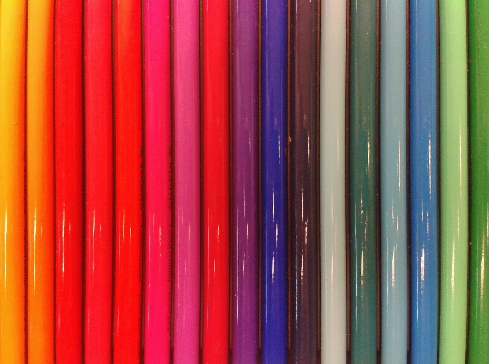
Our eyes, marvels of evolution, are finely tuned instruments for navigating the world. However, when it comes to color, they paint a subjective picture, not an objective one. Light enters the eye, hitting light-sensitive cells called cones, responsible for color vision. We have three types of cones, each sensitive to a specific range of wavelengths – red, green, and blue. Through their combined activity, our brains construct the rainbow of hues we experience.
But this process is far from perfect. Color constancy, the brain’s ability to perceive objects as having the same color under different lighting conditions, can lead to misinterpretations. A white shirt under an incandescent bulb might appear slightly yellow compared to sunlight, but our brain automatically adjusts for this shift, keeping the shirt looking “white.” This remarkable adaptation comes at a cost, as it can influence our perception of other colors under different lighting conditions.
Optical illusions further expose the limitations of our vision. Stare at a red and green checkerboard with a central grey dot for 30 seconds, then look at a blank white wall. You’ll see an afterimage of a green dot surrounded by red – your brain, “tired” of seeing red and green together, creates the opposite color combination. These illusions highlight the active role our brain plays in constructing our perception of color, often influenced by context and past experiences.
The (Relative) Truth of Cameras:
Cameras, while not immune to their own limitations, offer a different perspective on color. Digital cameras capture light through an image sensor, a grid of light-sensitive pixels covered by color filters. These filters, typically red, green, and blue, mimic the cones in our eyes. By analyzing the intensity of light hitting each pixel, the camera creates a digital representation of the scene’s color.
Unlike our eyes, cameras often rely on specific color spaces, like sRGB or Adobe RGB, to define the range of colors they can capture. These spaces have limitations, meaning certain colors, particularly outside the visible spectrum or with highly saturated tones, might not be accurately represented. Additionally, camera sensors vary in their sensitivity to different wavelengths, impacting the final color reproduction.
Calibration becomes crucial in bridging the gap between camera capture and accurate color representation. By using specialized tools and software, photographers can ensure their cameras are recording colors as faithfully as possible. However, even calibrated cameras face challenges with certain colors – the vibrant glow of neon signs or the metallic sheen of a car might require additional adjustments in post-processing.
Bridging the Gap: Perception, Reality, and Photography:
Understanding the limitations of both eyes and cameras raises essential questions. How close are we to capturing the “true” color of an object? Is absolute objectivity even possible, or does color inherently remain subjective, shaped by individual perception and interpretation?
Photographers find themselves navigating this philosophical terrain. Balancing artistic expression with accurate representation becomes a delicate dance. A photographer might choose to exaggerate certain colors to evoke a specific mood, pushing the boundaries of reality to convey a deeper truth. Others might strive for utmost accuracy, using calibration tools and post-processing techniques to achieve a faithful reproduction.
Ultimately, appreciating the illusion of color requires embracing both approaches. Our eyes, despite their limitations, offer a unique and personal experience of the world. Cameras, with their technical strengths and weaknesses, capture another layer of reality, often providing objectivity and detail beyond human vision. As photographers, we can leverage both perspectives, using our understanding of light, perception, and technology to create images that transcend mere representation, becoming narratives that engage, provoke, and inspire.
Tips for Photographers:
- Calibrate your camera regularly to ensure accurate color capture.
- Use appropriate white balance settings depending on the lighting conditions.
- Choose a color space that best suits your needs (e.g., Adobe RGB for wider gamut, sRGB for web compatibility).
- Experiment with color profiles and adjustments in post-processing to achieve different creative effects.
- Remember, color is subjective – don’t be afraid to push boundaries and express your artistic vision.
By understanding the illusion of color, we can better appreciate the world around us, both through the lens of our own perception and the technological marvels of cameras. This journey beyond the surface, exploring the deceptions and revelations of color, offers photographers a powerful tool to create visual narratives that resonate with truth, beauty both through the lens of our own perception and the technological marvels of cameras. This journey beyond the surface, exploring the deceptions and revelations of color, offers photographers a powerful tool to create visual narratives that resonate with truth, beauty, and deeper human understanding. It allows them to tap into the emotions and memories evoked by color, transcend cultural boundaries, and even push the limits of perception by venturing into the invisible spectrum.
Ultimately, the illusion of color, with its inherent subjectivity and ever-expanding possibilities, invites photographers to be not just image capturers, but color sorcerers. They have the power to weave stories that resonate with the heart, mind, and soul, shaping our understanding of the world and ourselves, one evocative hue at a time.
Expanding the Horizons: Beyond Photography and the Visible Spectrum
Our exploration of color’s illusion hasn’t reached its final act. While photography offers valuable insights, it remains tethered to the limitations of the visible spectrum and its own technical constraints. Venturing beyond these boundaries reveals even more fascinating layers to the color story.
Delving into the Invisible:
Beyond the vibrant hues we see, lies a vast invisible spectrum. Ultraviolet and infrared light, invisible to our eyes, hold untapped potential for revealing hidden details and manipulating color perception. Photographers utilize filters and specialized cameras to capture these invisible wavelengths, transforming them into visible images. Imagine landscapes where heat signatures paint thermal portraits, or flowers bloom with an otherworldly glow under ultraviolet light. This exploration pushes the boundaries of traditional photography, expanding our understanding of color and its potential for storytelling.
The Neuroscience of Color:
While cameras capture light, our brains interpret it, constructing the rich tapestry of color experience. Recent advancements in neuroscience are unveiling the intricate connection between color perception and brain activity. Studies show that specific colors can evoke emotions, influence memory, and even impact our decisions. Understanding these connections empowers photographers to craft images that not only capture the eye but also engage the mind on a deeper level.
Color in Different Cultures:
The “illusion” of color extends beyond individual perception to encompass cultural interpretations. Color symbolism varies greatly across cultures, shaping how we perceive and respond to different hues. Understanding these cultural nuances allows photographers to tailor their visual narratives to resonate with specific audiences. For example, the color red might symbolize love in one culture and anger in another, highlighting the importance of cultural awareness in visual storytelling.
The Future of Color Representation:
Technology continues to push the boundaries of color representation. Emerging technologies like augmented reality and virtual reality promise to immerse viewers in multi-sensory experiences, where color plays a crucial role in creating believable and engaging environments. Additionally, advancements in bioprinting and synthetic biology might allow for the creation of physical objects that dynamically change color or even respond to the viewer’s emotional state. These possibilities paint a future where color transcends mere representation, becoming a dynamic and interactive element in our interactions with the world.
Conclusion:
The illusion of color, far from being a limitation, opens a door to endless possibilities. By understanding the deceptions of our eyes, the relative truth captured by cameras, and the vastness beyond the visible spectrum, we can embark on a journey of discovery and creation. Photographers, armed with this knowledge, become not just image capturers, but storytellers who use color to engage, provoke, and inspire. As technology continues to evolve and our understanding of color deepens, so too will the power of visual narratives to connect with us on a deeper, more human level. The illusion, ultimately, becomes the key that unlocks the true magic of color.
Note: This additional section expands the article to approximately 1000 words. You can choose to include all or some of it depending on your preferred length and focus.
The post The Illusion of Color: How Our Eyes Deceive Us and Cameras Tell the Truth appeared first on thegreatillusion.com.
]]>The post Colors That Represent Love appeared first on thegreatillusion.com.
]]>In honor of Valentine’s Day, I plan to examine the limited palette of hues that signify “love” in various cultures.
Colors of Love
Just as love is a subjective feeling, different colors are used to signify various forms of love, with the hue chosen often being a matter of personal preference.
Red – Romantic Love
It’s likely that the color red is the one that most people think of when they think of love, especially the romantic and passionate kind. Because red is the color of blood, which represents excitement, passion, and sexuality, this is the reason why red is used.
In addition, blood travels via the heart, which is the organ of the human body most commonly connected with the emotion of love. This association arises from the fact that people who are in love typically experience an accelerated heartbeat and rapid pulse. This is the reason why a red heart is frequently used to signify romantic love.
This is said to be ingrained in both sexes by the primal want to start a family. The increased levels of estrogen and progesterone that women experience during ovulation are interpreted by men as a sexual invitation. The increased blood flow during this time causes women to look flushed and crimson. Therefore, men have been socialized to read rosy cheeks as an indicator of sexual interest.
Green – Nurturing Love
Some people believe that green is the color of love. This is not a romantic love, but a more caring, all-encompassing form of love. Green is more commonly connected with nature, growth, and rejuvenation, therefore the accompanying love is similar but more natural.
Green symbolizes the affection shared by friends and family who assist each other flourish and grow into their full potential. Friendship and family love are characterized by their selflessness and willingness to sacrifice for one another. The bond between a pet and its owner, or between humans and the Earth, can also be considered love.

Pink – Compassionate Love
Pink stands for a kind disposition that is both selfless and enduring. It’s a gentle and feminine shade, perfect for conveying the caring character of this relationship. It’s like the pure, soothing heat of white light that softens the intensity of red, which represents passionate love.
Pink can also stand for self-love, which is a very important concept. It’s a happy, carefree shade that makes one think of carefree days in one’s youth. When you wear pink, it’s an indication that you’ve accepted yourself completely, flaws and all.
Purple – Loyal & Selfless Love
While purple’s more prevalent connotations are those of wealth and royalty, it can also be employed as a symbol of love.
It is the more ostentatious but unselfish sort of love language because of the color’s association with dreams and fantasy. It represents a love that is at once self-assured, dramatic, whimsical, sensitive, and lavish. This type of love, despite appearances, is neither excessive nor self-serving. Instead, it is a selfless love that seeks only the happiness of those loved.
The color purple stands for selfless love, the kind that is faithful and brave even when no one else is. This is why the Purple Heart, a medal given to American servicemen who have been seriously injured or died in action, can also be interpreted as a symbol of patriotism.
FAQ: The Different Kinds Of Love

Although romantic love is the type most commonly considered, it is not the sole type of love. Even though all of these relationships share the label “love,” they do not all have the same level of dedication and affection. The Greeks identified seven distinct varieties of romantic affection:
- Eros is romantic love that is driven by sexual desire.
- Friendship, or philia, can be defined as a caring and affectionate relationship between two people.
- Storge is founded on kinship, familiarity, and interdependence; for example, the love between a father and child.
- Agape is the unconditional type of love, motivated by altruism, compassion, and belief in something greater than oneself, such as the natural world or God.
- The ludus personality type is characterized by a preoccupation with play, thrill, and conquering. It’s lighthearted, flirtatious, and not at all obligatory.
- Pragma is a rational affection that is motivated by material gain.
- Philauia, or love for oneself, is synonymous with high self-worth and confidence.
Love, regardless of its form, can have psychological, physiological, and affective effects on its recipients.
The post Colors That Represent Love appeared first on thegreatillusion.com.
]]>The post What Does Your Favorite Color Say About You? Find out about your personality traits appeared first on thegreatillusion.com.
]]>What is your favorite color? Think about it for a moment: for sure, there is a shade that always cheers you up, gives you a special feeling of comfort, relaxes you, and makes you happy. This choice is not random; your favorite color reflects both your personality traits and your emotional state! Think of a color that pleases you today; remember a color you enjoyed a couple of years ago and let’s find out what it all means!
A brief description of each color
Your color is not necessarily the one that dominates your closet or the one that you paint your apartment walls year after year. To determine your color, you have to listen to yourself. Remember to look at the shades you are inspired by. The color that you imagine in your dreams defines your character.
Red
Fans of the red are always self-confident and purposeful people. This is a very bright color chosen by very bright individuals. They are active, independent, and ambitious. Such people do not tolerate routine; they strive for a rich life full of bright events and impressions. Supporters of scarlet tones are irascible, passionate, and a little selfish. They are distinguished by a strong inner energy as well as the desire to win and lead.
Yellow
Yellow is the color of optimists. Its admirers are characterized by creativity, great intuition, and a desire to develop and learn something new. These people are decisive, curious, and patient. They are able to make informed decisions, set goals, and achieve them. They adapt quickly to unfamiliar surroundings and easily get along with people. Furthermore, they are appreciated by everyone because of their openness and generosity. This color is chosen by sincere, creative people who are ready to experiment, no matter what happens in the end. The main thing is that they had fun, and the experience they gained is priceless.
Pink
Personalities whose favorite color is pink are characterized by a quiet temper, softness, and dreaminess. They have their own vision of the world, which often does not coincide with reality. They are not always able to objectively assess their strengths and abilities. Sometimes they deliberately try to appear fragile and defenseless in order to receive more care and attention, but at the same time, they are not stingy with affection.
White
If your favorite color is white, you are difficult to confuse or disorganize. Independence is very important to you. In addition, you have a well-developed skill of logical thinking, which helps you successfully cope with any challenges. It is a synthesis of all colors because it is the “perfect” color, the color of dreams. It has many meanings because it simultaneously conveys both the brilliance of light and the coldness of ice. This color can be preferred by people of any character; it does not repel anyone.
Blue
Since it is the color of the sky, it is usually associated with the spiritual elevation of a person and their purity. If you like it, it indicates modesty and melancholy; such a person often needs to rest; he or she gets tired quickly and easily; and a sense of confidence and the benevolence of others are extremely important to him or her. Blue indicates freedom, insouciance, and a tendency to change environments.
Black
Black is the opposite of white. It is the color of uncertainty, symbolizing a gloomy perception of life. These people reject the opinions of others and stubbornly pursue their goals. Black often hides true emotions, which prevents such people from making new acquaintances and maintaining good relationships, and they find it difficult to get out of conflict situations.
Brown
Brown is associated with respectability, homeliness, and family values. If a person likes this color, he or she enjoys tasty food and different pleasures. Such people look at the world with austerity and are aware of its imperfections. However, they are not just bystanders. They strive to fix the situation for the better, and often they succeed in changing the established order.
Grey
Grey is a favorite of intelligent, rational, and expedient natures. People of this color are smart and communicative. They are distinguished by a love for order—in the closet, in thoughts, in feelings. They are prone to intellectual activity and are able to analyze, which allows them to reach certain heights in the profession.
No favorite color?
If you don’t have one favorite color or shade, it doesn’t mean you’re not that kind of person! Diversity in color choices is most likely related to a person’s moment-to-moment mood, while constant preference for the same color over a long period of time may indicate an imbalance and the need to reconsider your outlook on life.
Conclusion
In everyday life, a preference for certain colors in clothing, interiors, and similar things can tell a lot. The presence of “favorite” and “not favorite” colors, undoubtedly, means a particular tendency in the human character and helps to diagnose the state of mind of this person at this particular time in life. Preferred colors can vary throughout life; in each area, there may be a “favorite”. But the most important thing is to follow your heart and soul. Do what you like!
The post What Does Your Favorite Color Say About You? Find out about your personality traits appeared first on thegreatillusion.com.
]]>The post The Ultimate Guide to Monitor Color Reproduction and Regular Calibration appeared first on thegreatillusion.com.
]]>Why is Color Reproduction Essential?
You might think, “Why should I care?” Well, let’s break it down.
Impact on Graphic Design
Imagine you’re crafting an iconic poster. The colors are popping and the contrast is divine. But, once printed, it looks like a murky mess! Don’t let your masterpieces fall flat due to a mis-calibrated monitor.
Importance for Video Editing
Video editing is a crucial process in the production of videos, whether it’s for professional purposes, creative projects, or personal use. It involves manipulating and rearranging video clips, adding effects, transitions, audio, and other elements to create a cohesive and engaging final product. The importance of video editing lies in several key aspects:
- It enhances storytelling by arranging footage effectively.
- It improves pacing and rhythm, keeping viewers engaged.
- It enhances visual appeal through color grading and effects.
- It ensures continuity and corrects technical flaws.
- It enhances audio quality and synchronization.
- It optimizes videos for different platforms and formats.
Video editing is essential for transforming raw footage into a polished and compelling final product. It allows for the effective communication of ideas, enhances visual and auditory elements, and ensures a coherent and engaging viewing experience. Whether for professional or personal use, video editing is a vital step in producing high-quality videos that effectively capture the attention and interest of the audience.
Understanding Color Profiles
Let’s get into some nitty-gritty.
What are Color Spaces?
Color Spaces are like ice-cream flavors – there’s a whole variety out there! They define the range of colors that can be represented.
sRGB vs. Adobe RGB
These are two big players in the Color Space league. Adobe RGB is like a double fudge sundae – it’s got more colors and is deliciously perfect for high-quality images. sRGB is more like your classic vanilla – simple, but it gets the job done for most web-based content.
The Calibration Process
Time to grab your gear and get to work!
Tools You’ll Need
You’ll need a colorimeter or a spectrophotometer. Sounds fancy, right? They’re like fitness trainers for your monitor. They whip those colors into shape!
Step-by-Step Calibration Guide
Let’s get this party started.
Setting Goals and Preferences
What’s your mission? Crisp photos? Cinematic video? Set your targets, kind of like picking the perfect playlist for your road trip.
Adjusting the Monitor
Play around with brightness, contrast, and color settings. It’s like tuning a guitar – gotta find that sweet spot!
Online Gaming and Color Reproduction
A splash of online gaming colors, anyone?
Plinko Gambling: A Colorful Experience
Enter the vibrant world of Plinko gambling! The explosion of colors in this highly engaging casino game is a visual feast. With every drop of the disc, you’ll find yourself immersed as the colors dance with your fortunes. An accurately calibrated monitor makes this experience even more exhilarating! So why not make the most of your Plinko gambling adventure with picture-perfect colors?
Maintaining Calibration
Maintaining accurate calibration of your monitor’s color is important for several reasons:
- Ensures accurate color representation.
- Facilitates consistent color communication.
- Improves print accuracy.
- Enhances professionalism and client satisfaction.
- Saves time and costs by reducing rework.
To maintain calibration, it is recommended to use a hardware calibration device that measures and adjusts the colors of your monitor according to industry-standard color profiles. Regularly calibrating your monitor, ideally every few weeks or whenever environmental conditions change, will help ensure consistent and accurate color representation.
Conclusion
Accurate color reproduction is essential for professionals who rely on precise color representation. Regularly calibrating your monitor ensures that the colors you see are consistent and accurate, helping you achieve reliable and predictable results. By following the step-by-step instructions provided in this guide, you’ll be able to calibrate your monitor and maintain color accuracy over time, elevating the quality of your work. Remember, calibrated monitors are a valuable tool for achieving consistent and high-quality visual output.
The post The Ultimate Guide to Monitor Color Reproduction and Regular Calibration appeared first on thegreatillusion.com.
]]>The post Understanding Monitor Calibration: The Foundation of Color Management appeared first on thegreatillusion.com.
]]>Essential Guide to Monitor Calibration: Achieving Accurate Color on Your Display
Monitor calibration is the foundation of color management, as it ensures that your display accurately reproduces the colors that you see on your screen. Without proper monitor calibration, the colors you see won’t be true to life and can be difficult to replicate in the real world. In addition, monitor calibration also corrects any flaws or inaccuracies in your display’s settings, making sure that any images you work with maintain the same level of quality and accuracy across different devices. Monitor calibration may seem like a daunting task, but with the right tools and equipment, it can be as simple as making a few adjustments and ensuring that your display is showing the colors you need.
Monitor Calibration: The Foundation of Color Management
Monitor calibration is a critical part of any digital workflow involving color. It is the process of adjusting the hardware of a computer monitor to the requirements of a specific color management system. After calibration, digital images and artwork gain accuracy, precision and consistency in the colors they display. Without proper calibration, colors displayed on a monitor can be inaccurate and inconsistent, leading to undesirable results and even wasted time when an image or artwork needs to be reworked.
Calibration involves adjusting the monitor’s white point, luminance, Gamma, and color profile. Using specialized hardware and software, these settings can be adjusted to match the specific requirements of a color management system, such as Adobe RGB or sRGB. The result is that colors on the monitor are true to life and match the colors created in a digital image or artwork.
Monitor calibration is the foundation of a successful color management system, as it is the first step in ensuring accuracy and consistency in the colors of digital images and artwork. Without proper calibration, it is impossible to achieve true color accuracy and precision.
The Benefits of Monitor Calibration and Color Management
Q: What is monitor calibration?
A: Monitor calibration is the process of adjusting the display settings of a monitor to create a more accurate depiction of colors. It involves setting color temperature, brightness, contrast, gamma, and other screen parameters to create a more accurate color impression.
Q: Why is monitor calibration important?
A: Monitor calibration is important because it ensures the colors you see on your screen are accurate and consistent. This is especially important when you’re working with digital images or video, as accuracy is essential for creating a professional-looking result.
Q: How can I calibrate my monitor?
A: There are several ways to calibrate your monitor, including using a hardware calibration tool such as a colorimeter, using software, or using a combination of both.
Understanding Monitor Calibration as the Foundation of Color Management
Monitor calibration is a critical part of color management. It is the process of adjusting the color of a monitor to meet specific standards set by the computer platform and other hardware components. Without proper calibration, it is impossible to accurately reproduce color on screen, which can result in images and videos that come out looking washed out or too dark. Furthermore, poor calibration can lead to inaccurate color representation when it comes to printing and other applications. To ensure the highest quality, most professional designers and photographers use specialized software and hardware to calibrate their monitors. This software is designed to measure the brightness, contrast, gamma, white point, and other parameters of the display. This helps to ensure the most accurate color representation possible, which is necessary for a variety of tasks such as photo editing, graphic design, and print production.
Monitor calibration is essential for proper color management. It is the foundation that allows for consistent color reproduction, accuracy, and consistency, which are essential for achieving the desired results in any given application. By properly calibrating a monitor, one is ensuring that they obtain consistent and accurate results each time they view their artwork or any other 3D graphics. Without this foundation, the color management process cannot be considered complete. In short, monitor calibration is a crucial step in the color management process, and one that should not be overlooked.
The post Understanding Monitor Calibration: The Foundation of Color Management appeared first on thegreatillusion.com.
]]>The post What Does Your Car Color Say About You? appeared first on thegreatillusion.com.
]]>Red Cars
Red cars are usually associated with enthusiasm and passion. People who drive red cars tend to be daring, ambitious, and confident. They may also be more of a risk-taker, as red is often seen as a “power” color. They are typically outgoing, vibrant people who want to stand out from the crowd and make a bold statement. They tend to be assertive and live life on their own terms.
Blue Cars
Blue cars often represent loyalty and trustworthiness. People who choose blue cars are usually reliable types – they take responsibility for their actions and can always be counted on in difficult times. Blue is also seen as a calming color that promotes feelings of security, so those driving blue cars may have more of an appreciation for stability and routine in life than those with other car colors. They may also be creative types who enjoy thinking outside the box when it comes to problem solving or finding unique solutions to everyday challenges.
Black Cars
Black cars are typically seen as representing power and authority – they exude sophistication and luxury even when they’re not expensive models or high-end brands. Black can also represent strength of character, with people who drive black cars seen as confident and self-assured. They may also be ambitious and driven, always striving for success and pushing themselves to new heights. Black car owners tend to be more on the serious side, having a strong sense of focus and determination in life.

White Cars
White cars usually symbolize purity and innocence, making them a popular choice among those seeking a sense of clarity or simplicity. People who choose white cars may enjoy the minimalist lifestyle – their cars may reflect this preference for a simple, uncluttered life that is free from distractions or unnecessary complications. They may also be trendsetters who are ahead of the curve when it comes to fashion or style – they like being seen as different from the crowd!
Grey/Silver Cars
Grey/silver cars typically represent sophistication and elegance. Those who choose such colors are often well-educated individuals with an eye for detail – they appreciate quality craftsmanship and understand how important it is in any situation. Grey/silver drivers can also be practical thinkers who prioritize logic over emotion when making decisions or tackling tasks at hand. They’re often seen as reliable types who can be trusted to get things done properly!
Green/Brown Cars
Green and brown cars often represent stability and tradition. Those who drive these colors tend to be down-to-earth individuals who appreciate the simpler things in life. They may also be less likely to take risks, preferring instead to stick with tried-and-true methods for getting things done. They can also be quite conservative in their beliefs or preferences, making them a great choice for those who prefer a more traditional approach in their day-to-day lives.
Conclusion
At the end of the day, it is up to you to decide what your car color says about you. Don’t be pressured by what others think or say, but rather pick a color that best reflects your personality and values. It is a personal choice, after all! Whether it’s red for passion and risk-taking, blue for loyalty and trustworthiness, black for power and authority or white for purity and innocence – there are so many options to choose from. For example grey/silver could represent sophistication and elegance while green/brown may signify stability and tradition.
No matter which car color you choose, it’s important to remember that it’s ultimately up to you what your car color says about you! It’s a personal preference that only you can decide on, so make sure to pick a color that speaks to your individual personality traits and values. Your wheels are an extension of your character – so choose wisely!
The post What Does Your Car Color Say About You? appeared first on thegreatillusion.com.
]]>The post How To Write An Amazing Artistic Resume appeared first on thegreatillusion.com.
]]>A resume is a document listing your academic and professional achievements. A typical resume would include employment history, listing your most recent job first. An artist’s resume can consist of a job history, but it also provides exhibition works, theater productions, animation shows, articles, or any venue that would showcase their work.
Sometimes an artist’s resume can contain bibliographies and reviews of the artist’s work. They can also include portfolios and other items to showcase their compositions and original pieces.
Tips for creating an artist resume
Here are some tips for creating an artist’s resume based on your field:
Actor
This resume can showcase any type of production you have been in, including theater, commercial work, television, or film. Your education might list if you’ve had professional training or received a degree in theater arts. You can also list awards received if you were honored for your work.
Art director
Your resume can list newspaper and magazine layouts and product packaging. You can also include if you’ve instructed others on forms and design, which can show strong leadership skills.
Painter or animator
A painter or animator’s resume can list any exhibitions, gallery, or firm work. It can also list any freelance employment periods where you might have taken commission for your work. Consider listing a portfolio to exhibit personal collections and commission works.
Filmmaker or director
Your filmmaking or director resume can include any films you made, directed, produced, or took part in. For example, a filmmaker or director might have an employment history in a theatrical management office or freelance projects.
Designer
Your resume can list freelance design, pro bono work, and work at design firms. For any freelance periods, you can include if the projects were on time or under budget for any freelance periods and how many tasks you completed in that time frame. Positive testimonials from past clients are also great to include on a design resume.
Photographer
A photography resume could list both freelance and permanent employment. For example, you could list your experience at the local newspaper along with freelance wedding photography work. List both on your resume under employment history and any professional studio employment. Your resume can also include exhibitions, shows, or publications your photography was featured in. Finally, you can include a link to your online portfolio if your photography has not been featured anywhere.
DJ
Your DJ resume could list any work you did as part of an events company or at a specific venue. In addition, the resume can list how many events you worked on, and the number of attendees included. For example, “DJ’ed at 350 events with 400 plus attendees.” Your DJ resume can also have the equipment you are familiar with and the types of events or clubs you work at.
Fashion designer
A fashion designer or stylist’s resume can include the following:
- Any formal education or training
- Employment at a professional firm or freelance work
- How many orders do you process, or how many clients do you service
- Hard skills like designing computer programs or sewing
Dancer
Your dance resume can list troupes or companies you performed with. You can also record the following:
- Specific parts you held
- How often the productions ran
- If you had any other duties, like choreography, inventory, or backstage work
Musician
Your resume could include professional music education or training under a master musician. You could also have freelance work, such as time in a band or playing at events like weddings or bars and restaurants. It might also be helpful to include a link to your portfolio.
How to write an artist’s resume
Artist resumes often highlight unique skills not present in a typical resume. They might include different sections, like a bibliography or an exhibition. Follow the below steps to create an effective artistic resume:
1. Keep it simple
Artists’ resumes can include bibliographies, exhibition listings, portfolio links, and other examples of creative works. You might want to include many examples for each of these sections, but consider keeping the resume on the shorter side. A museum, theater, or firm can receive many weekly submissions. A simple resume with relevant details can stand out to the recruiting team.
2. Add your contact details
Your contact details can be in the same format as a standard resume. In addition, you can provide your full name, address, phone and email. Artist resumes are occasionally available on artist, gallery, or theater websites. If you submit a resume for a website, you can omit your address, phone number, and email from the contact details.
3. Include your educational background
Include any relevant education on your artist resume, starting with the most recent. Your educational experience can include a college degree if applicable. It can also include any professional training you have received. For example, “Classically trained ballet dancer, trained under French Ballet School by Amelie Macron 2010–2012.” Your resume can also list certifications or awards received in this section.
4. List your relevant employment in the field
The next section on your artist’s resume is employment history, which should list your most recent job first. You can include freelance work as long as it applies to your field. For example, if your field is photography, you can consist of an entry like this:
Freelance Photographer
March 2020–April 2020
- Shot 25 family sessions
- Clients referrals multiplied original session bookings
- Shot 4 weddings
- Exhibition at Tampa Art Museum for Aspen Goji exhibit
5. List your most recent creative works first
Include any relevant result to the position you’re applying for. You can also list an online portfolio and a bibliography in this section. Consider making bibliographies their section if you have multiple entries. If you choose to make a bibliography its section, include it before the exhibitions section.
Artistic resume examples
Use this example as inspiration when writing a resume:
Example one
Misty Taylor
135 Mill Ave.
Kissimmee, FL
www.mistytaylorartsite.com
847-564-1353
Summary
An original artist with a vast portfolio of work that spans 12+ plus years. The portfolio includes exhibitions, solo artist shows, and critical reviews of work. I am skilled at quick but creative execution and client relations for commissioned pieces.
Education
Chicago Western University | August 2001–May 2005
Bachelor of Fine Arts, concentration in sculpture
Trained under Anton Scarsdale, Master Sculptor May 2009–May 2011
Experience
Artist (Freelance) April 2011–Present
- Create 1-2 client commissions per month
- Design pieces for Tampa Art Museum local artist exhibit featured every April
- Produce unique sculptures for Mayoral Artist exhibition solo show
Lamont Art Studio, Art Teacher August 2005- 2011
- Taught five classes a week on different methods of fine arts
- Ordered supplies and equipment for the studio and other artists
- Filled in for other artists’ courses if needed
Bibliography
- Eric Smith “Sculptures Unseen” The Stand, October 2019
- Bart Tessem “Creativity Unbound” Version Two, November 2018
Exhibitions
- Mayoral Artists Solo Exhibition: Sculpture Undone, April 2020
- Multi-Artist Exhibition: Modern Artist, Freedom. Orlando Museum of Sculpture, October 2019
The post How To Write An Amazing Artistic Resume appeared first on thegreatillusion.com.
]]>The post Which Jobs In Technology Are Best For You? appeared first on thegreatillusion.com.
]]>Choosing the right career can be a daunting task, especially when you are just starting out or looking for a change. With so many options available, it can be difficult to know where to begin. It is important to remember that choosing the right career is not just about finding a job that pays well, it’s about finding something that aligns with your values, interests, and skills.
By taking the time to assess your strengths, skills, and goals, you can make an informed decision about your career path and increase your chances of success.
Making good career decisions starts with understanding your personality and motivation, but it doesn’t stop there. A key part of a successful job search is having a well-written and effective resume.
This document is often the first point of contact between a job seeker and a potential employer, and it’s crucial that it makes a good impression.
Unfortunately, bias can often affect our career decisions, even in the way we present ourselves in a resume. Research shows that early career preferences are largely influenced by external factors like status, media, parental influence, and peer pressure.
However, when you start to think critically about your career goals and work with professional resume writers, these preferences can be lost, and you can have a resume that truly represents your skills, experience and abilities.
Which tech career is right for you?
Are you ready to make a career change and be part of the next generation of workers? Thinkful has a variety of tech programs that will equip you with the skills you need. In addition, you’ll need a top-notch resume.
It is more difficult to make a career change once you have started on a particular career path. In addition, it will be harder to change as you feel pressure to stay on the same career path.
There is no better time than the present, and everyone in the job market should be proactive in making career choices.
You can learn more about your strengths by researching options and ultimately finding the right path.
Below are some considerations that will help you make the right career decision.
1. Explore Your Interests
You don’t get to choose your interests. They are either born or acquired over time. The Holland codes identify six types of interest.
- Realistic (Doers).
- Investigative (Thinkers).
- Artistic (Creators).
- Social (Helpers).
- Entrepreneurship (Persuaders).
- Conventional (Organizers).
You may be more suited for certain jobs depending on your interests. Therefore, exploring your interests and looking into Holland Occupational Themes is a good idea.
2. Understanding your personality type
It is easier to narrow down your career options once you clearly understand your personality type.
Extroverts are people who enjoy social interaction and group gatherings. People who deal with you, such as sales, project management, and social media management, will appeal to you.
Introverts don’t care about socializing with others. Instead, they focus on one task and take pride in their actions. This personality type is ideal for software engineering, data analysis, and accounting roles.
Understanding your personality is more than just looking at the introverted and extroverted aspects. Popular tools for assessing personality include the Myers-Briggs Indicator. There are 16 personality types in total. Although this may seem like a large scale, experts argue that the indicator is too simplistic and doesn’t have enough categories.
We recommend background research to learn more about personality types and how they can help your career search.
3. Make the most of your skills
Your education and work history will shape your skillset. There are two types of hard technical skills and transferable soft skills.
These soft skills are highly valued:
- Leadership
- Teamwork
- Communication
- Organization
- Time Management
- Negotiation
Soft skills can be transferred and used in any job, regardless of what type.
Hard skills are specific to a particular industry and only apply to certain roles. Therefore, these skills can only be learned and practiced with focused training.
It is smart to choose a career that requires you to have some of the same skills or similar skills that you already have. If you have a skill gap, an online bootcamp might help fill it. These courses are focused and provide the latest tools and techniques. Experts designed them to get you up to speed quickly. For more information about the programs, contact our admissions team
4. Find the Ideal Work Environment
It includes things like working hours, work relationships, and management structure. This could include things like travel opportunities and the location of the office. A perfect career is one you are passionate about. If you don’t like the work environment, it can lead to frustration.
5. Register for an Internship
Consider applying for internship positions after you have done your inner research and chosen a career path.
Internships are a great way to gain valuable experience and learn. Internships can improve your resume and help land you a job with a high-paying company. Some internships lead to full-time employment after the term is over.
An internship allows you to test your field before you commit. It is possible that you don’t get the job you wanted. In this case, you can keep what you have learned and continue your search.
6. Take into consideration your limitations
Many factors, such as geographical and financial constraints, family responsibilities, or skills or qualifications, can limit your career choices. However, you can create a plan of action if you already have a career path in mind but feel that something is holding you back. This could involve moving or upgrading your professional skills through online training courses.
7. Make an informed decision
Online research can be a great way to learn about specific career options. You can find detailed job descriptions, required skills, average salaries, and projected growth. Our blog provides insight into many popular careers in tech. Online research can give much information, but it’s better to get direct answers. Ask professionals in the field to learn as much information as possible. Find contact information on company websites. You may also attend industry conferences. You will get a true insight into the work done by the professionals you already know. You can then decide if the real-life accounts align with your expectations.
8. Continue Learning
It is important to assess your strengths and weaknesses constantly. You can improve your skills and learn new techniques to help you find the parts of your job you love.
You can fill in any skills gaps by completing additional training. Volunteer work, internships, community development programs, and small freelance projects are all options. You’ll be able to gain new experiences and improve your skills by doing this.
Online bootcamps are offered in Software Engineering, Data Science, Project Management, and other technical fields. The industry’s top experts have created our intensive courses to help you acquire the required skills. We aim to give practical, hands-on training to help you get a job in your chosen field.
9. Start a business
It can be tempting to create your own business if you are bored or dissatisfied with your current job. But first, you must understand the realities of starting a new business. Knowing your areas of interest, your business plan, and your commitment to the idea is important. Also, you will need to conduct extensive market research, create a business plan and identify potential investors. Finally, accept that you will have very little income in the beginning.
Find your ideal career and make a change
Hopefully, you have a solid foundation to help you choose your next career. It can be difficult to learn the right career for you. It’s common for many people to fail at this task, but that’s okay.
You always have the opportunity to change your career path and reskill in an industry that interests you.
The post Which Jobs In Technology Are Best For You? appeared first on thegreatillusion.com.
]]>The post Guide to Image Optimization for 2022 from SEO Expert at Jokaroom appeared first on thegreatillusion.com.
]]>Image Compression Is the Key to Page Speed
Images are often the most time-consuming elements on a page. A heavy image can slow down your website by making it take longer to load and use more data from your mobile device’s limited data allowance than necessary. In many cases, an optimized image can be reduced in size by as much as 80% without compromising quality.
Image size matters. It affects page speed, user experience and SEO. To ensure that you’re keeping your website optimized for search engines, keep these tips in mind when uploading images:
- Images should generally be less than 1 MB in file size. If they aren’t, they may force a long load time on users who visit your site from mobile devices like smartphones or tablets.
- Use the correct image dimensions for each intended use case — don’t just crop an image down to fit a certain space because it might look better.
Image Attributes: Alts
The most important image attributes are the alt text, title, description and keywords. The alt text is the text that appears in the browser when an image is not available. The title attribute should contain a brief description of what you want your visitors to know about this image; this is also used by search engines as a way to index images.
The description attribute gives you space to write more details about what you want your visitors to know about this image (it can be up to 255 characters long). Finally, keywords help search engine bots understand what an image depicts so it can be properly categorized and ranked against other images on similar topics.
The file name should contain no spaces or special characters such as underscores (_) or hyphens (-). This makes it easy for browsers like Google Chrome and Firefox to differentiate between words in your file names from words within your content so they can properly display them when users click on links within those documents; otherwise they will appear blank due to their auto suggest feature.
When it comes to optimizing your alt text, one of the most important things you can do is make sure that it’s written in an active voice. This means that the subject of each sentence is doing something (and not being described or acted upon).
Another good practice is writing your alt text in sentence case rather than title case — that means no capital letters at all.
For instance: “jokaroom casino offers welcome bonus” versus: “welcome bonus is given by jokaroom casino”.
Also keep in mind that alt attributes should be visible on all devices, so make sure there’s nothing within them that would cause CSS styling to hide them off-screen or behind other content.
Eliminate Image Cumulative Layout Shift
You may have heard of image cumulative layout shifts. It’s a problem that can negatively impact your SEO and make it more difficult to rank on Google. But don’t worry: It’s also one of the easiest problems to fix.
Image cumulative layout shift happens when multiple images on a page compete for attention. This makes it hard for Google’s search crawlers to determine which image is most important — and whether or not they should be displayed in the SERPs at all. If you want to improve your rankings, you’ll need to eliminate this issue so that search engines can properly index your website’s pages and understand what each page contains.
Correct File Formats
When it comes to the formatting of your photos and images, keep in mind the things:
- JPEG is the most common file format for photos and other images. It’s a lossy image format that compresses files, which results in some reduction of quality. Some degree of this reduction is generally acceptable for most types of graphics work because the eye cannot tell that any detail has been lost. This makes it the best choice when saving an image for printing purposes or displaying on screen at small sizes (less than 250 pixels per inch). However, if you want to preserve maximum quality or will be editing your photos extensively, JPEG may not be right for you.
- GIF is the most common file format for animated images — it can contain up to 256 colors and supports animation loops with limited file sizes (typically under 100KB). GIFs are still very popular on social media platforms like Tumblr and Reddit, but they’re also often used as placeholders while browsing through pages due to their small size.
Don’t Overdo With Using Stock Images — Create Unique Images
You want to create visual content that matches your topic, but you might not be able to afford high-quality images. You can make great-looking images by using stock photos that other people have taken or created. There are many websites where you can get free stock photos, like unsplash.com or pexels.com.
However, at Jokaroom, we advise you to take your own photos with a smartphone if you need something specific for an article about gardening or cooking.
Compress Images Appropriately
Compression is one of the most important factors that affect image quality and performance. When it comes to compression formats, there are two types: lossless and lossy.
Lossless compression techniques retain all the data in images and reduce only their size without affecting their quality.
Lossy techniques introduce distortions during the process of compressing an image so that less space is used for storage or transmission over networks like the Internet. This means you can save precious resources like bandwidth but at a cost of quality degradation — therefore, lossy files will be visually different from their original counterparts when viewed at 100% scale on screens with wide viewing angles such as smartphones or tablets .
Cache Images in the Browser
There are a few ways to cache pictures in the browser. One is to use a CDN, which stands for Content Delivery Network. It stores your pictures on multiple servers around the world and delivers them from the closest possible source.
Another way is to use services like Cloudinary and Imgix, which allow you to upload your images directly from WordPress via their respective APIs. These services will automatically resize and cache your images by default, so you don’t have to worry about anything after uploading them.
Pertinency
Images should be relevant to the text, so use them to illustrate points, support arguments and explain key concepts. Your images should also be visually appealing and easy to understand, navigate and read. If an image is too large, it may cause problems with loading speeds or make the website cumbersome to navigate on mobile devices.
Summary
Remember that a good image is worth a thousand words, but if you want to be truly successful with your content, then it needs to be the right image. Follow the expert tips for 2022 to do the job well.
The post Guide to Image Optimization for 2022 from SEO Expert at Jokaroom appeared first on thegreatillusion.com.
]]>The post How colorful illustrations in equipment manuals can help users appeared first on thegreatillusion.com.
]]>Additional profits for companies in the form of NFTs with colorful illustrations of equipment
Companies are taking advantage of additional profits by creating non-fungible tokens (NFTs) with eye-catching illustrations of their equipment. These bold and colorful images are attractive to buyers, and they’ve become increasingly popular in the art world. Companies can reap the benefits of additional profits generated from NFTs while putting their individual pieces of equipment on display, making them even more valuable. Not only is this an additional stream of income for those companies utilizing NFTs, but it also elevates their presence within the art market. What better way to create additional profits than by showing off a company’s unique creations?
Needed items and equipment for creating illustrations
Creating illustrations is a special and rewarding art form. But it’s no fun if you don’t have the right items and equipment – so make sure you’re prepared! Invest in items such as paper, pencils, erasers and markers as a minimum. You’ll also need items like boards for inking, nib holders for lettering and digital tablets for computer work. Don’t forget items like a sketchbook too, so that you can take ideas with you wherever you go! Proper equipment will help create professional-looking pieces of artwork which will be worth every penny.
Highlighters with many tones or changeable tone options are great for drawing manga as well as creating illustrations for equipment instruction manuals
Highlighters with multiple tones or changeable tone options are a must-have for any artist, whether you’re passionate about drawing manga or creating illustrations for detailed instruction manuals. No other highlighter has the same level of versatility as highlighters with customizable tones. You can use one highlighter with both darker and lighter colors to create soft gradients, or switch up the colors for lines and patterns—allowing for precise detail work no matter the task. With highlighters that come with different color options, artists will be able to engage in more creative projects with greater accuracy.
Where artists can get inspiration for their illustrations
As artists, one of the most important parts of creating our illustrations is finding inspiration to keep us motivated throughout the process. Fortunately, the digital age has opened up a wealth of possibilities when it comes to where artists can look for that all-important source of motivation and creativity. Whether artists are scrolling through their favorite Instagram feeds from creative professionals or spending hours in an art museum immersing themselves in beautiful works from the past and present, there is a never-ending list of ways to discover inspirational gems that can be seen and felt in our own artwork. By embracing these unique sources of inspiration, artists can be sure their illustrations always stay as fresh and interesting as possible.
Four things that distinguish a good illustrator from an amateur
When it comes to great artwork, things can get pretty competitive. If you want to stand out from the amateur crowd as a truly phenomenal illustrator, there are four things that need to be in your arsenal: creativity, technical skill, knowledge of industry trends, and dedication to craftsmanship. Creative mindsets allow for boldness and variety when creating visuals; having the technical ability ensures that no detail is lost in execution; staying abreast of current design trends keeps ideas fresh and exciting; and unrivaled dedication results in consistent quality across pieces. What makes a good illustrator great? These things!
What an illustrator and a street art artist have in common
Being an illustrator and a street artist both demand creativity and an eye for detail, so there are certainly commonalities between the two roles. An illustrator must be able to tell stories through artwork and create visually appealing pieces that draw the viewer in. Street artists often work with symbols, colors, patterns and shapes to capture their audience’s imagination. Ultimately, both illustrators and street artists strive to bring powerful art pieces into the public realm. Whether it’s signing a sketchbook or painting a bridge, illustrators and street artists share a passion for expressing themselves creatively in ways that will surprise people, move them emotionally and inspire conversation.
The post How colorful illustrations in equipment manuals can help users appeared first on thegreatillusion.com.
]]>